Something big is coming!

You may have seen some hints and talk around the church about North Church doing a new re-design. Well, it’s true! We’ve been in the process of updating and implementing our current branding! Though this change is exciting, we want to look back at the history and meaning behind our previous branding.

Life Center's Logo (Early 90's-1999)

The history goes back to our sister church, Life Center, as it was their original logo from early 90's. The meaning behind the logo was a mosaic pattern, being our broken pieces, coming together to restore our heart, which happens when Christ is at the center. This was their logo up until we planted in 1999. We wanted to honor our sister church the best we could and expand the mission and vision that started at Life Center.

Life Center North (1999-2012)

With our first branding came the change to Life Center North Church. While keeping the same logo to honor our sister church, we make minor tweaks to start our journey! We kept this branding from Northwood Middle School through the Lyons Building.

North Church "Version 1" (2012-2021)

Once we got our home building in 2012, we needed to change our name to establish a more permanent identity in our community. We changed our name to North Church, and with that came an updated branding. We decided to push deeper with branding identity and implement a mosaic pattern to represent all of our broken pieces coming together to represent the heart with the cross in the center. 

North Church "Version 2" (2021-2023)

When Mike Meade started to transition on Nate Meade as new lead pastor, we began talks of a re-design. Although not immediately, we wanted to usher in a new era with an updated brand. For the transition, we decided not to implement a new design but to update it to our current hope of the church. We wanted a community that includes people from all age demographics in a wholistic church body! With a mix of retro elements in a modern style, we knew this was going to be a great temporary branding for our transition.
After close to 25 years of a 50 year this branding and a new lead pastor, we figured it was time for an update once more! Contrast Design helped with our re-brand by listening to our hope of what the new branding would convey. We loved the meaning behind our original design, and they put it into action!

North Church (Present)

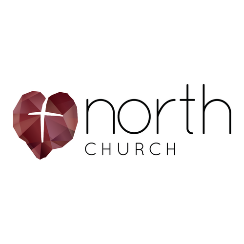
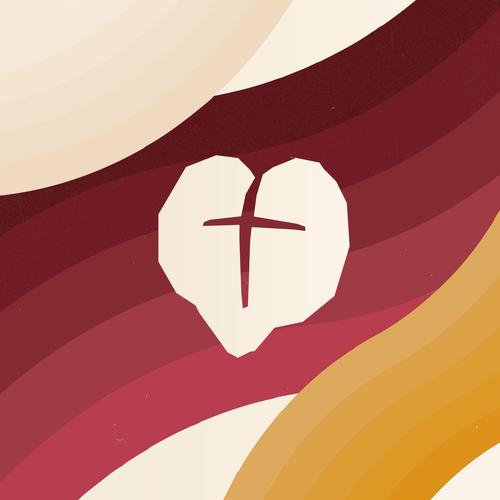
We kept close to the meaning of our original logo. We based it around Colossians 2:10.

"...and in Christ you have been brought to fullness. He is the head over every power and authority."
- Colossians 2:10

The pieces of the cross represent our individual broken pieces that form together and are made whole through Jesus's life, death, and resurrection. It's the many lives of North Church growing together in relationship, being unified in Christ. The cross has historically been a symbol to represent Jesus and His love for humanity, and that is something that we at North Church want to share in Spokane and around the world!

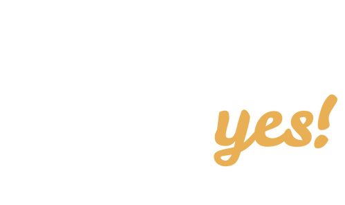
You can expect a full release by September 10th! Throughout all these changes, we are keeping the same mission and vision. We exist to inspire others to say “Yes!” to God by becoming wholehearted followers of Jesus, connecting in healthy and growing relationships, and boldly living and sharing the gospel in Spokane and around the world!

Different look. Same heart. Same mission.